Saturday, October 24, 2009

ARCH1142- Atlas of Colour


I found the Atlas of Colour workshop quite intense, but enjoyable as I was able to experiment with various InDesign, Photoshop and hand manipulating/crafting techniques which I had never come across before. The workshop also had a strong focus on nature, and how it impacts on the way we perceive buildings. This was interesting to learn as nature surrounds us, and will inevitably have a huge impact on how we create buildings in the future. Furthermore, learning about colour theory and its significance allowed us to be more perceptive both in drawing and designing.

Tuesday, September 15, 2009

ARCH1142- Fluid Thoughts to Actions (Week 3)

Today, we went on a field trip to the Museum of Sydney, and gathered in the forecourt where we did two drawings. Both involved 5 thumbnail sketches of different perspectives and aspects of the museum. The first drawing was done in watercolour, and the second in charcoal. Both drawings incorporated movement, which was created through the change of one position.

Saturday, September 12, 2009

ARCH1142- Fluid Thoughts to Actions (Week 2 HWK)

3 hour ink/watercolour drawing done at home involving at least one movement of space to express duration and movement.

Theme:
Series of 0bjects of interest

I decided to choose this goldfish and crystal ball sculpture as the focus for my drawing, as I was fascinated by the translucency of the object. Consequently, this gave me the opportunity to execute different watercolour strategies in my drawing, such as transparency and tonal wash. For the scales of the goldfish, I tried to use some stippling to create a varied effect.

Process:

1. Stretch watercolour paper
2. Outline objects in pencil
2. Block in lightly with ink
3. Detail objects with different shades of ink (mix ink with different amounts of water)
4. Move to different position (after 1.5 hours of drawing and painting)

Tuesday, September 8, 2009

ARCH1142- Fluid Thoughts to Actions (Week 2)

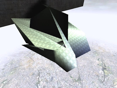
We were taught how to stretch watercolour paper; simply by coating water over the paper (mounted on MDF board) to prevent it from curling during the drawing/painting process. For the rest of the lesson, we did a series of ink exercises, learning different methods such as stippling, tonal wash and tonal layering.
Saturday, August 29, 2009

ARCH1142- Fluid Thoughts to Actions (Week 1)

Our first exercise involved the use of charcoal, where we captured the 'movement' of Chrissie and Anton whilst they wandered around the room in circles. I was quite unclear of where to start, as we had to do this exercise without looking down onto our piece of paper. But after a while, I started drawing this 'movement' and found it to be quite enjoyable and free. The second exercise was drawing one view of the room in which we were in. Again, we couldn't look down. Afterwards, using a different medium (charcoal) I went over my drawing again..but this time, through observing the space; hence creating a more accurate depiction. Based on pure observation, we learnt how to immerse ourselves into drawing, and stay focused for the entirety of the drawing (each lasting around 15 minutes+). Overall, it was a pretty intense studio session, yet it was rewarding as I learnt different drawing techniques.

Friday, August 28, 2009

ARCH1142- Material Modeling (Week 4)

Week 4: 3D EXPLOSION

Through the limited use of balsa wood, we were asked to explore the idea/concept of “Freedom.” My model mainly communicates the “Freedom” in the use of materials; where ripping, tearing, bending, slicing and joining of balsa is evident in the model. By using balsa dowels to raise the central platform, I also intended to convey the way in which I perceive "Freedom; where I feel that 'openness' and 'space' are the key elements.

ARCH1142- Material Modeling (Week 3)

Week 3: BODY, SPACE, CITY This exploration in 3D was based on a series of photos which I took at The Rocks, Circular Quay. On the journey, I was struck by a large alleyway, and decided to capture this experience of when a person is confronted by an alleyway surrounded by tall walls. The height is portrayed through stacking pieces of roughly cut foam. This may seem ironic as bricks are not soft, yet this material produced a crumbly effect, which I thought was relevant. The pieces of play-dough at the bottom of the artwork represent the fascinating flooring patterns I discovered along the paths.

ARCH1142- Material Modeling (Week 2)

Week 2: TEXT AND BUILT FORM ENTWINED

We were required to build a 3D model, following our review of a philosopher’s text s well as an artist/their artwork. With a short time limit of 2 hours, this was quite challenging yet it was enjoyable and rewarding as I learnt some new modeling techniques. Being limited to white card had allowed us to explore the one material in greater depth. My piece is influenced by Christo’s artwork “The Gates,” where repetition was a key element. The text I chose was by Maurice Merleau Ponty, and a key idea I found in that text was that “everything co-exists with one another.” Through connecting geometric hexagons together, I have tried to convey this idea.

ARCH1142- Material Modeling (Week 1)

Week 1: AUTOMATIC EXPLORATION

Using the words Memory, Dream, Terror, Desire and Confinement, we were asked to sketch immediate responses for each word on A3 paper. With a limit of 20 minutes per drawing, the main aim of this exercise was to encourage us to think outside the square, and be more confident with putting abstract ideas to paper as soon as they come to mind.


Monday, June 22, 2009

EXP 3- Filefront & Sketchup Upload Links

Final Map:

http://www.zshare.net/download/616965443d0ff83e/

Draft 1:
http://www.zshare.net/download/616941075e05d7aa/

Draft 2:
http://www.zshare.net/download/616944743916ec7f/

Google Sketchup Warehouse Upload Link (Table & Elevators):

http://sketchup.google.com/3dwarehouse/details?mid=30bb9b55b2fb203b59bee6a7bffe1c01

Saturday, June 20, 2009

EXP 3- Final Developed UT Environment Images

Whole environment

Prada's Office:


Back view of Prada's office

Closeup of Prada's office floor space

I have adjusted the lighting in the final model for Prada's office to make it harsher and more solid. This was intentional as her office mimics 'Extravagance.' The elevator, which can also be seen in these image captures is pink and purple; highly feminine and fashionable. In the UT Environment, the texture is animated, further enhancing the flashy nature of fashion.

Meeting Space with dining table:

The dining table is situated in the centre of the meeting space, on top of glass flooring. The soft purple that hits on both the dining table and the chair evokes a warm feeling, allowing the two to relax from their chaotic lives. The sharp points on the table is particularly clear in this image, representing how sharp and quick-witted the clients are.

Obama's Office:


Interior view of Obama's office


A ride on Obama's elevator

Obama will be working on both the top and bottom level of the office. The two staircases are quite large, demonstrating Obama's leadership and dominance within American society. The glass panel up the top suggests a sense of 'protection'; Obama protecting not only his family, but the whole of America.

Thursday, June 18, 2009

EXP 3- Unreal Environment 2nd Draft

Prada's Office:

Meeting Space:

Obama's Office:

Wednesday, June 17, 2009

Monday, June 1, 2009

EXP3- Screenshots in the UT environment (First Draft)

View from meeting space to Prada's office and Obama's elevator:

Meeting Space:

Prada's elevator:

Prada's office:

Obama's office:

Sunday, May 31, 2009

EXP 3- Prada's Office (Final Draft)

Here, the curvy thin pieces are intended to be like strips of satin/fabric. I found this suitable as Prada is known for using a wide range of materials in her designs and fashion items. As mentioned previously, Prada's space is aimed to highlight extravagance, with a large platform outside that acts like a catwalk platform. It has been noted that despite being one of the wealthiest women in the fashion industry, she is quite low-key. Consequently, I have used the interior space, which is quite minimal to accentuate this side of Prada.

EXP 3- Table (Final Draft)


This final design of the table is quite different from the first draft. I was not entirely satisfied with the previous table legs, thus I have created these two sharp points as legs instead. These points allude to the fact that both Obama and Prada are sharp and quick-witted. By using glass, it represents the fact that as people of "Power" in the 21st century, they are innovative and unconventional.

Add Image